CASE STUDY
Morcles Diablerets Muverans Association
Establishing a visual identity, a website and ten double-sided A1 panels for the 100th anniversary of the first ascent of the Miroir de l'Argentine. Two months' work for an association that had just been formed.
THE CONTEXT
The Context
The Morcles Diablerets Muverans Association had just been formed to look after the landscape and local history around Gryon. They had a name, a committee and nothing else. I spent two months with them putting the brand together.
Two things had to happen at once. The identity had to be built from scratch, and there was a date already fixed — the 100th anniversary of the first ascent of the Miroir de l'Argentine, which the association was marking with an event at Solalex. Everything had to be ready for it.
Two things had to happen at once. The identity had to be built from scratch, and there was a date already fixed — the 100th anniversary of the first ascent of the Miroir de l'Argentine, which the association was marking with an event at Solalex. Everything had to be ready for it.
THE SCOPE
What the work covered
Brand Identity
Graphic Design
Event Promotion
Web Design
Exhibition Design
Print Design
Visual Identity
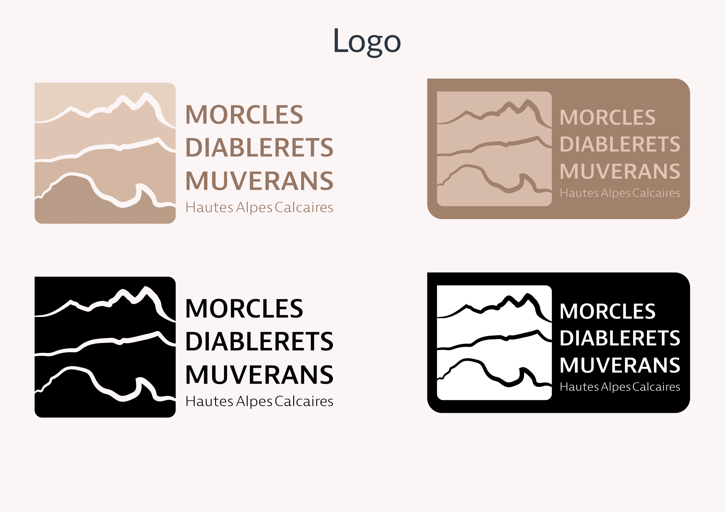
The logo and the core brand elements: type, colour, and how the mark behaves on a poster versus a panel versus a letterhead. The association is named after three massifs, and the mark came out of that.
Event material
Posters, flyers, digital graphics and a landing site for the centenary, all built on the same system so they could be produced quickly and still match.
The exhibition
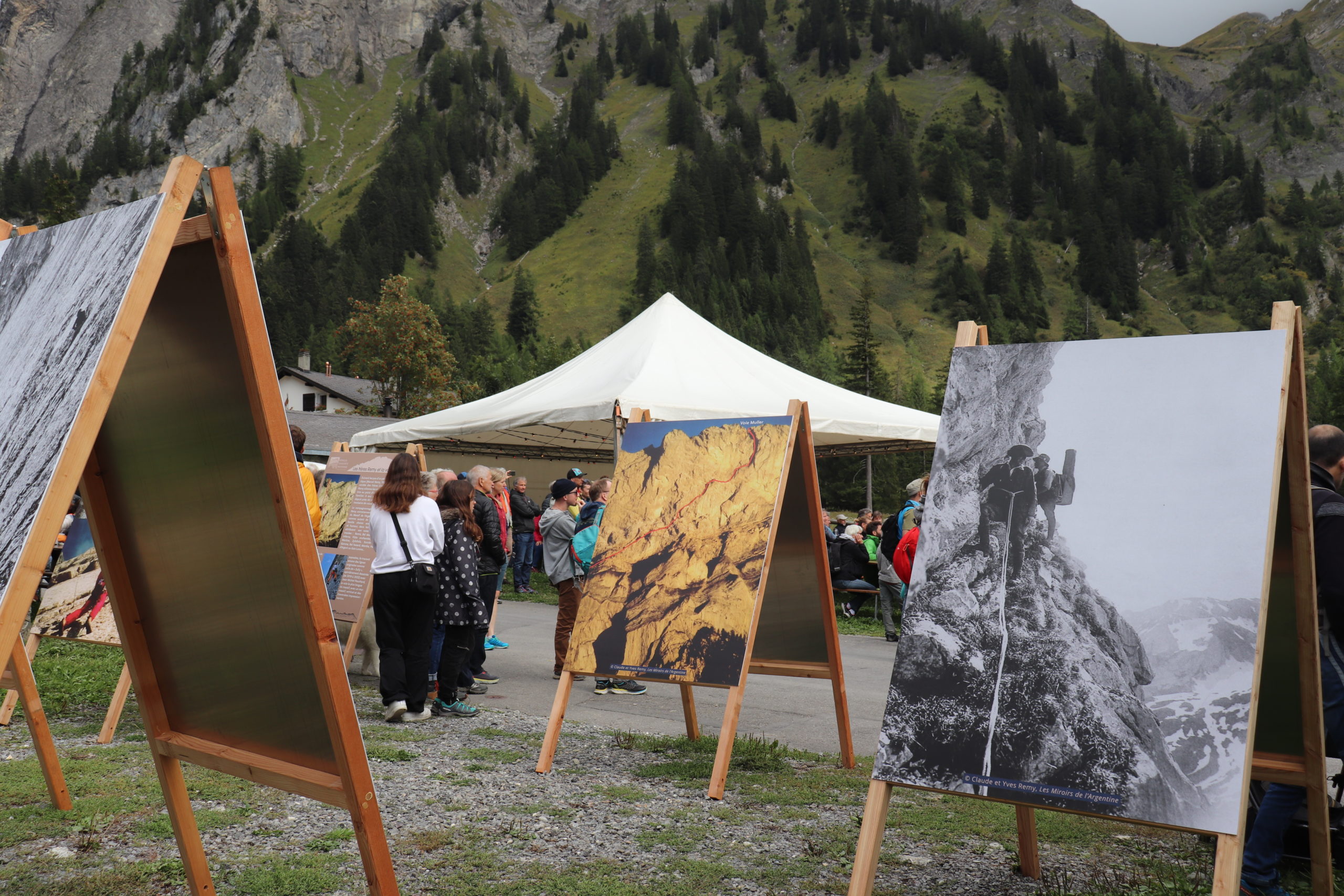
Ten double-sided A1 panels condensing the Rémy brothers' Les Miroirs de l'Argentine into something you can read standing up, outdoors, at 1,460 m.
THE WORK
Didactic sign

The same type and colour rules across the site, the flyers and the panels.
Deliverables
What got delivered
Mostly physical work. Things people picked up, walked past, or stood in front of.
Distinctive Branding
One mark, used on everything from the letterhead to the panels standing at Solalex.
Website and print, one system
The landing page and the printed material share a type scale and a palette, so the event read as one thing across a village.
Interpretation panels
An entire book condensed onto ten double-sided A1 boards. The association went through the Rémy brothers' Les Miroirs de l'Argentine and chose what had to survive the cut. I built the layout around their selection, sized to be read standing up, outdoors, in flat light.
Media & Exposition


The Motivation
My grandfather's restaurant
Growing up in Gryon, this region has always held a special place in my heart. This project, however, was meaningful on a much deeper, personal level—my grandfather was among the first mountain guides in the area and actually owned the restaurant in Solalex, right where the centenary event and exhibition took place.
Being able to apply my design and technical skills to celebrate the local history and support an association dedicated to preserving the landscape of my childhood was a rare and profound privilege.
← Back to Selected Works